Apogee Space Club
Designing for curiosity beyond Earth.
For the past two years, I've worked with Apogee Space Club, shaping its visual presence across social media, events, editorial launches, and club merchandise.
From a magazine launch and National Space Day to astrophotography workshops, night-sky events, STEM MUN, team announcements, T-shirt designs, and everyday stories — my work has focused on turning complex space and science themes into visuals people actually want to stop and explore.
The Problem
Apogee's S-TIC had a powerful story to tell — India's space journey, its scientists, its missions. But most space publications felt cold, technical, and inaccessible. The content was rich but the presentation wasn't pulling people in. The brief was simple: make this feel like something people actually want to read, not just something they feel they should.
The Problem
Apogee's S-TIC had a powerful story to tell — India's space journey, its scientists, its missions. But most space publications felt cold, technical, and inaccessible. The content was rich but the presentation wasn't pulling people in. The brief was simple: make this feel like something people actually want to read, not just something they feel they should.
The Challenge
Space is fascinating. Communicating it isn't always easy.
Apogee runs events with completely different personalities — scientific conferences, telescope sessions, magazine launches, workshops, and community events.
The challenge was to make every campaign feel distinct enough to tell its own story, while still belonging to the same space-driven community.
No repetitive templates.
No generic galaxy poster every time.
The visual language had to evolve with the event.
The Problem
Apogee's S-TIC had a powerful story to tell — India's space journey, its scientists, its missions. But most space publications felt cold, technical, and inaccessible. The content was rich but the presentation wasn't pulling people in. The brief was simple: make this feel like something people actually want to read, not just something they feel they should.
My Role
I handled few Good section's visual design of Issue 02 — from the cover to individual spread layouts. This included typography decisions, color palette development, illustration direction, image treatment, and the overall editorial grid system that held the magazine together across 60+ pages.
My Role
Social Media Design · Visual Direction · Editorial Design · Merchandise
I worked across the club's visual communication, designing:
Social media campaigns and stories
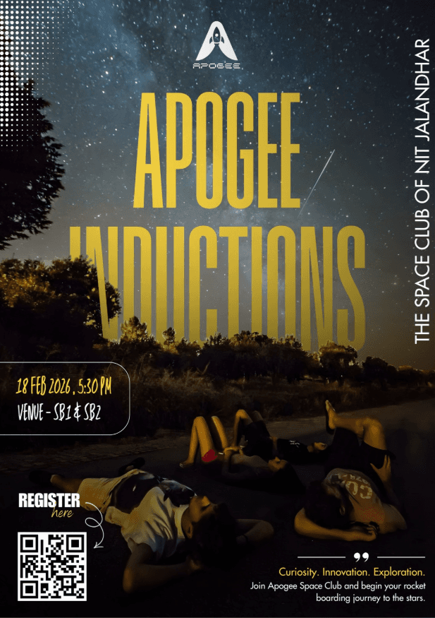
Event launch posters
National Space Day creatives
Magazine launch campaigns
Brahmand magazine visuals
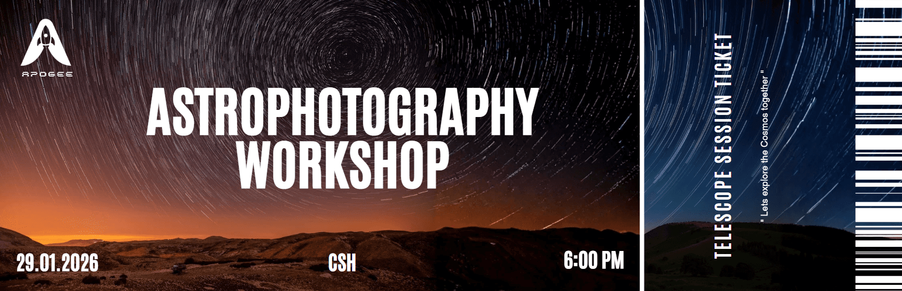
Astrophotography workshop creatives
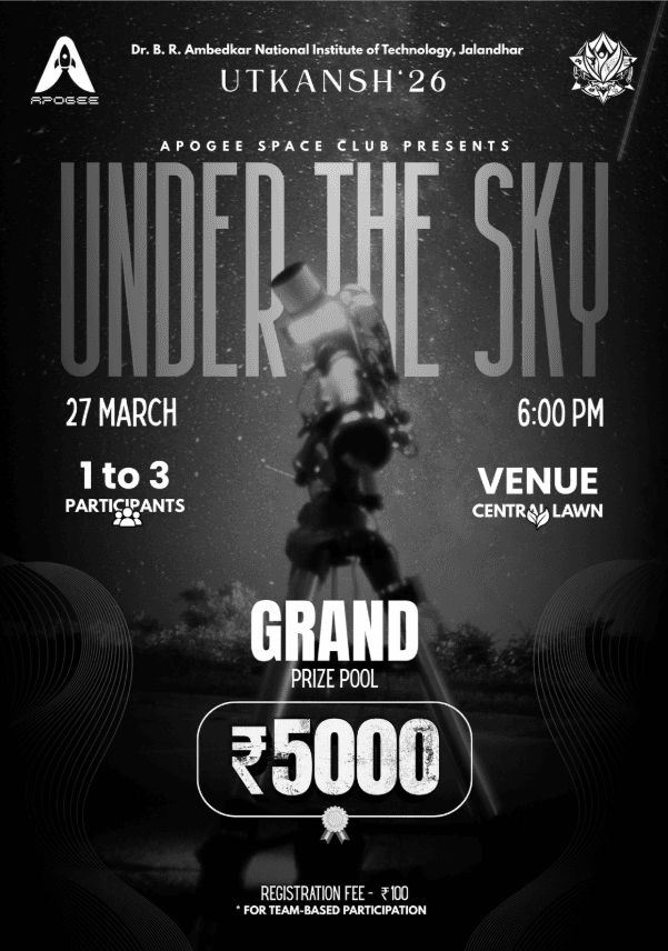
Night-sky and telescope event posters
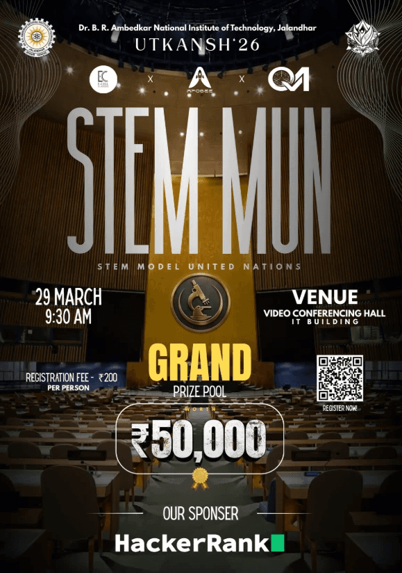
STEM MUN campaign assets and ID cards
Team announcement creatives
T-shirt graphics and merchandise concepts
Over two years, the work grew from individual posts into a much broader visual system for the club's communication.
The Problem
Apogee's S-TIC had a powerful story to tell — India's space journey, its scientists, its missions. But most space publications felt cold, technical, and inaccessible. The content was rich but the presentation wasn't pulling people in. The brief was simple: make this feel like something people actually want to read, not just something they feel they should.
Understanding the Audience
Before touching a single layout, I asked: who is this for? The target reader was a young, curious Indian — someone interested in science but not necessarily a specialist. That shaped everything. The design couldn't feel like a textbook. It had to feel like a magazine that respects the reader's intelligence while making space science genuinely exciting.
The Design Approach
One universe. Multiple visual languages.
Instead of forcing every event into one rigid template, I treated each campaign as its own visual world.
Scientific events used stronger hierarchy, structured grids, and information-led layouts.
Night-sky and astrophotography campaigns leaned into atmospheric imagery, contrast, and cinematic typography.
Magazine launches became more expressive — using editorial compositions, collage systems, photography, and experimental type.
Community posts felt energetic, approachable, and more human.
The constant wasn't a template.
It was the feeling of curiosity, exploration, and space.


The Problem
Apogee's S-TIC had a powerful story to tell — India's space journey, its scientists, its missions. But most space publications felt cold, technical, and inaccessible. The content was rich but the presentation wasn't pulling people in. The brief was simple: make this feel like something people actually want to read, not just something they feel they should.
The Design Problem
Space content has a visual cliché problem — dark backgrounds, stock NASA imagery, generic blue gradients. It all looks the same. My real challenge wasn't "make it look good." It was "make it look like nothing else in this space while still feeling credible and serious."
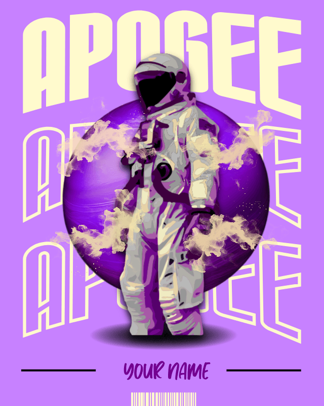
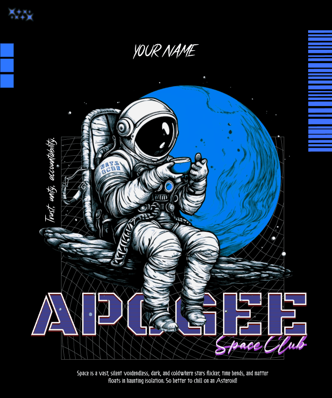
From Screen to Print
My work with Apogee extended beyond Instagram.
For Brahmand, the club's space magazine, I worked on visuals surrounding the magazine and its launch — translating the identity into editorial and promotional communication.
I also explored physical touchpoints such as T-shirt graphics and STEM MUN identity cards, making sure the club's visual world could exist beyond a social media feed.


The Problem
Apogee's S-TIC had a powerful story to tell — India's space journey, its scientists, its missions. But most space publications felt cold, technical, and inaccessible. The content was rich but the presentation wasn't pulling people in. The brief was simple: make this feel like something people actually want to read, not just something they feel they should.
The Problem
Apogee's S-TIC had a powerful story to tell — India's space journey, its scientists, its missions. But most space publications felt cold, technical, and inaccessible. The content was rich but the presentation wasn't pulling people in. The brief was simple: make this feel like something people actually want to read, not just something they feel they should.
Two Years of Iteration
The work changed as I did.
Working with Apogee for two years gave me something a one-off project couldn't: the ability to look back, question my own design decisions, and improve the next campaign.
Typography became more intentional.
Layouts became more controlled.
Visual hierarchy became clearer.
And I became more comfortable giving each event its own identity without losing the personality of Apogee.
The Problem
Apogee's S-TIC had a powerful story to tell — India's space journey, its scientists, its missions. But most space publications felt cold, technical, and inaccessible. The content was rich but the presentation wasn't pulling people in. The brief was simple: make this feel like something people actually want to read, not just something they feel they should.
The Problem
Apogee's S-TIC had a powerful story to tell — India's space journey, its scientists, its missions. But most space publications felt cold, technical, and inaccessible. The content was rich but the presentation wasn't pulling people in. The brief was simple: make this feel like something people actually want to read, not just something they feel they should.
The Outcome
What started as designing social media creatives became an ongoing role in shaping how Apogee communicates visually.
Across events, campaigns, editorial launches, merchandise, and social media, I helped create a visual presence designed to make science feel less distant and exploration feel more inviting.
Still designing. Still experimenting. Still looking up.
Client
Apogee — The Space Club of NIT Jalandhar
Client
Apogee — The Space Club of NIT Jalandhar
Scope
Social media design, event campaigns, magazine
launch creatives, editorial promotions, T-shirt design,
stories, event identity, and print assets
Scope
Social media design, event campaigns, magazine
launch creatives, editorial promotions, T-shirt design,
stories, event identity, and print assets
Role
Social Media Manager & Graphic Designer
Role
Social Media Manager & Graphic Designer
Year
2+ Years · Ongoing
Year
2+ Years · Ongoing
Tools
Adobe Photoshop / Canva /
Kittl / Figma
Tools
Adobe Photoshop / Canva /
Kittl / Figma
