The Problem
Apogee's S-TIC had a powerful story to tell — India's space journey, its scientists, its missions. But most space publications felt cold, technical, and inaccessible. The content was rich but the presentation wasn't pulling people in. The brief was simple: make this feel like something people actually want to read, not just something they feel they should.
The Problem
Apogee's S-TIC had a powerful story to tell — India's space journey, its scientists, its missions. But most space publications felt cold, technical, and inaccessible. The content was rich but the presentation wasn't pulling people in. The brief was simple: make this feel like something people actually want to read, not just something they feel they should.
The Problem
Apogee's S-TIC had a powerful story to tell — India's space journey, its scientists, its missions. But most space publications felt cold, technical, and inaccessible. The content was rich but the presentation wasn't pulling people in. The brief was simple: make this feel like something people actually want to read, not just something they feel they should.
My Role
I handled few Good section's visual design of Issue 02 — from the cover to individual spread layouts. This included typography decisions, color palette development, illustration direction, image treatment, and the overall editorial grid system that held the magazine together across 60+ pages.
The Problem
Apogee's S-TIC had a powerful story to tell — India's space journey, its scientists, its missions. But most space publications felt cold, technical, and inaccessible. The content was rich but the presentation wasn't pulling people in. The brief was simple: make this feel like something people actually want to read, not just something they feel they should.

Understanding the Audience
Before touching a single layout, I asked: who is this for? The target reader was a young, curious Indian — someone interested in science but not necessarily a specialist. That shaped everything. The design couldn't feel like a textbook. It had to feel like a magazine that respects the reader's intelligence while making space science genuinely exciting.
The Problem
Apogee's S-TIC had a powerful story to tell — India's space journey, its scientists, its missions. But most space publications felt cold, technical, and inaccessible. The content was rich but the presentation wasn't pulling people in. The brief was simple: make this feel like something people actually want to read, not just something they feel they should.
The Design Problem
Space content has a visual cliché problem — dark backgrounds, stock NASA imagery, generic blue gradients. It all looks the same. My real challenge wasn't "make it look good." It was "make it look like nothing else in this space while still feeling credible and serious."
The Problem
Apogee's S-TIC had a powerful story to tell — India's space journey, its scientists, its missions. But most space publications felt cold, technical, and inaccessible. The content was rich but the presentation wasn't pulling people in. The brief was simple: make this feel like something people actually want to read, not just something they feel they should.

Design Decisions and WHY…
Color system: I gave each story its own color world — red for urgency and ambition (Dr. Udupi Rao's story), orange for warmth and courage (Kalpana Kalahasti), purple for the cosmic and mysterious (Edwin Hubble), black for depth and gravitas. No spread shares the same background, but the typography logic stays consistent throughout — that's what makes it feel like one magazine, not a collection of random pages.
Typography: I used oversized, bold headlines as the primary design element — not decoration, but structure. On pages like "Pioneer of the Distant Stars" or "The Satellite Visionary," the type IS the layout. The body copy stays small and precise, creating a strong contrast that guides the eye naturally.
Portrait treatment: Every featured person gets the cut-out treatment — removed from their background, placed against a bold color. This was a deliberate choice to make scientists feel iconic, not institutional. They're heroes of this story, not subjects of a Wikipedia article.
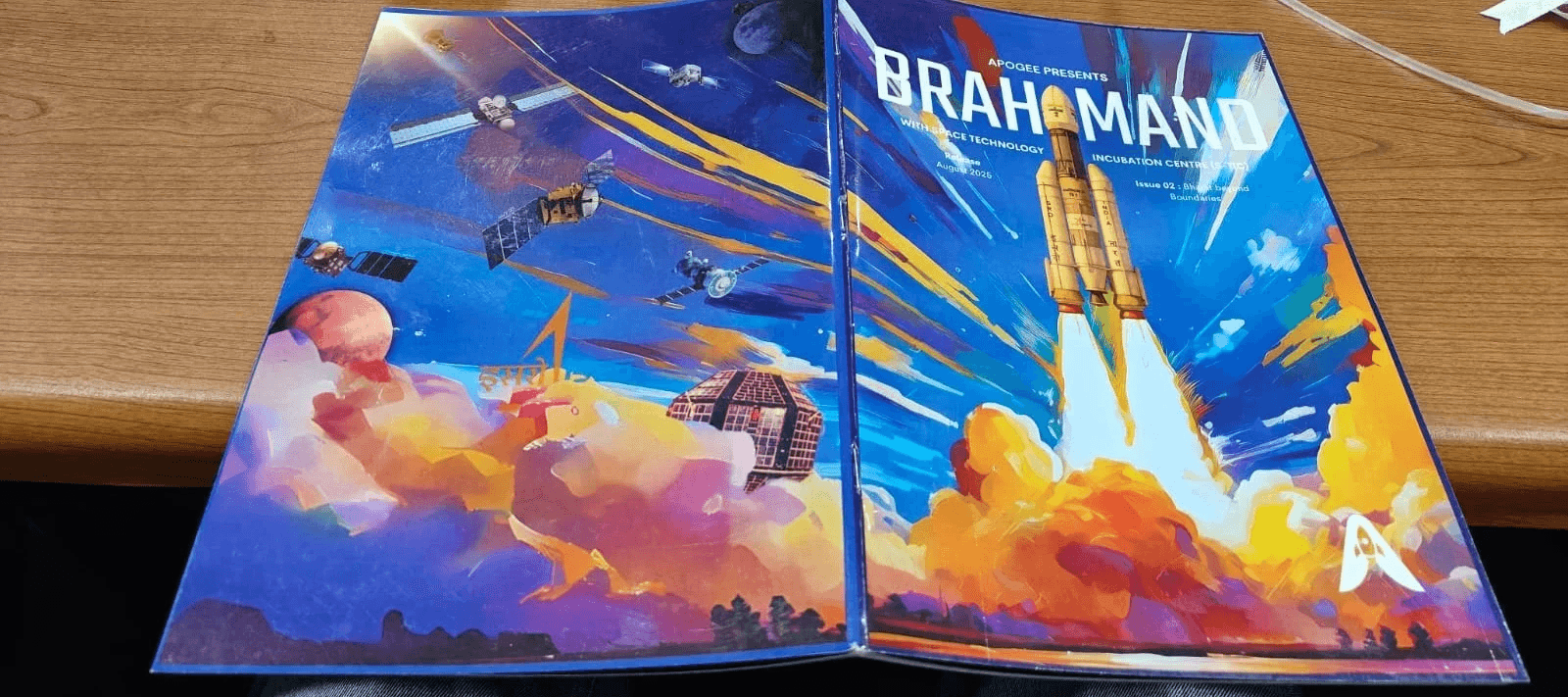
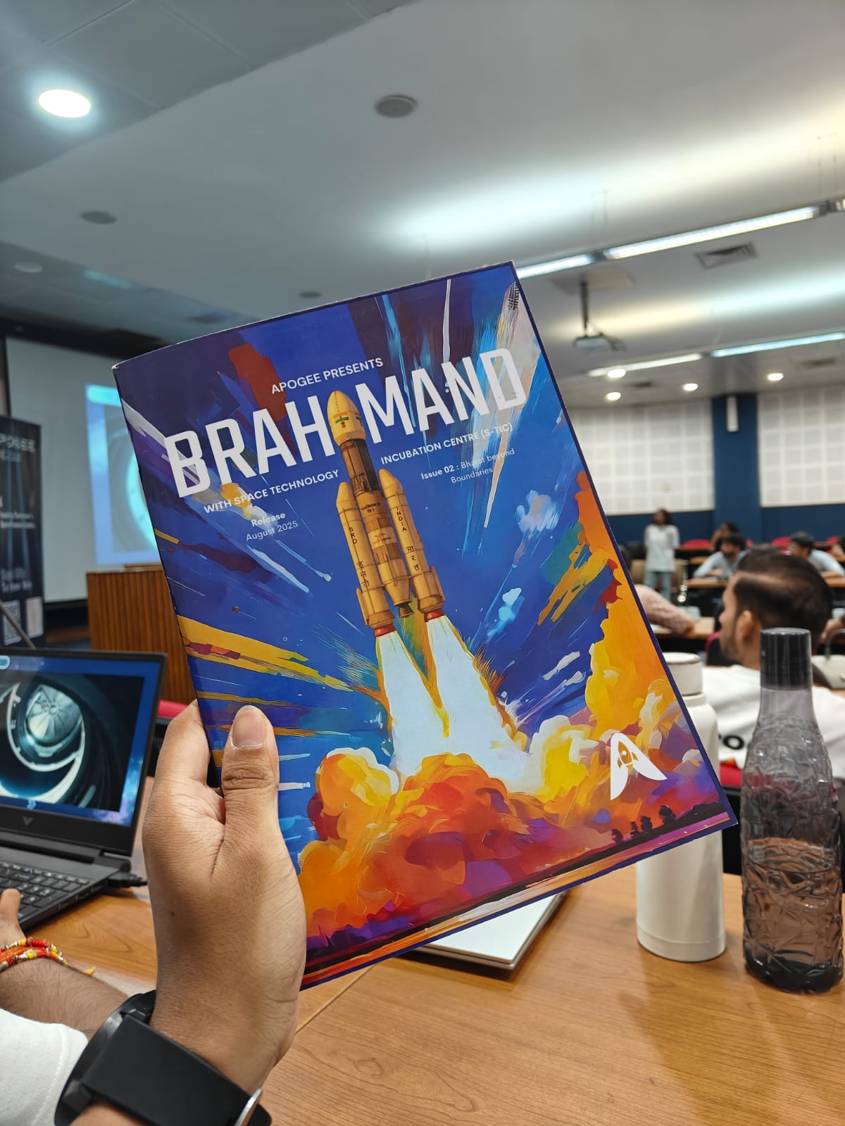
Cover: The cover leads with a cinematic illustrated rocket launch — painted, not photographed — setting the tone immediately: this isn't a dry science publication. The INDIAN FLAG sits quietly within the masthead, signaling whose story this is without stating it.
Back Cover: A deliberate contrast to the cover's energy. Every major satellite India has launched — GSAT, INSAT, Mangalyaan, Chandrayaan and more — floats across an illustrated cosmic landscape, each labeled in light, restrained type. No loud headlines. Just India's full space legacy, laid out quietly. The most understated spread in the magazine, which is exactly why it works.



The Problem
Apogee's S-TIC had a powerful story to tell — India's space journey, its scientists, its missions. But most space publications felt cold, technical, and inaccessible. The content was rich but the presentation wasn't pulling people in. The brief was simple: make this feel like something people actually want to read, not just something they feel they should.
The Problem
Apogee's S-TIC had a powerful story to tell — India's space journey, its scientists, its missions. But most space publications felt cold, technical, and inaccessible. The content was rich but the presentation wasn't pulling people in. The brief was simple: make this feel like something people actually want to read, not just something they feel they should.
Iterations and Challenges
The hardest spread to design was the Chandrayaan-3 section — there was a lot of information to fit without it feeling like a wall of text. I went through multiple layout variations before landing on the large quote pull combined with the mission imagery. The quote from Kalpana Kalahasti ("Failure is something that happens when we quit...") became the emotional anchor of that section, which freed the surrounding pages to carry the factual content without feeling heavy.
The NAYAN spread ("Lens Through Universe") was the most experimental — splitting a face across two pages, using a monochrome palette when every other spread was bold and colorful. That contrast was intentional — it gives the reader a moment to breathe before the next burst of energy.
The Problem
Apogee's S-TIC had a powerful story to tell — India's space journey, its scientists, its missions. But most space publications felt cold, technical, and inaccessible. The content was rich but the presentation wasn't pulling people in. The brief was simple: make this feel like something people actually want to read, not just something they feel they should.
The Problem
Apogee's S-TIC had a powerful story to tell — India's space journey, its scientists, its missions. But most space publications felt cold, technical, and inaccessible. The content was rich but the presentation wasn't pulling people in. The brief was simple: make this feel like something people actually want to read, not just something they feel they should.
What I Learned…
Designing a magazine taught me that consistency and variety aren't opposites — they're partners. The moment I stopped trying to make every spread look the same and started trusting the typographic system to do the unifying work, the layouts became much stronger and much faster to produce.
I also learned that editorial design is fundamentally about pacing — knowing when to be loud, when to be quiet, and when to let an image do all the talking.
The Problem
Apogee's S-TIC had a powerful story to tell — India's space journey, its scientists, its missions. But most space publications felt cold, technical, and inaccessible. The content was rich but the presentation wasn't pulling people in. The brief was simple: make this feel like something people actually want to read, not just something they feel they should.
The Problem
Apogee's S-TIC had a powerful story to tell — India's space journey, its scientists, its missions. But most space publications felt cold, technical, and inaccessible. The content was rich but the presentation wasn't pulling people in. The brief was simple: make this feel like something people actually want to read, not just something they feel they should.
What I'd do Differently…
I'd spend more time on the grid system before starting individual layouts. Some spreads required rework because I hadn't fully locked in the column structure early enough. A stronger grid foundation would have made the process faster and the result more precise.
I'd also push the cover typography further — the BRAHMAND masthead works, but there was more I could have done to make the cover feel even more distinctly Indian without relying only on the ISRO logo reference.
The Problem
Apogee's S-TIC had a powerful story to tell — India's space journey, its scientists, its missions. But most space publications felt cold, technical, and inaccessible. The content was rich but the presentation wasn't pulling people in. The brief was simple: make this feel like something people actually want to read, not just something they feel they should.
The Problem
Apogee's S-TIC had a powerful story to tell — India's space journey, its scientists, its missions. But most space publications felt cold, technical, and inaccessible. The content was rich but the presentation wasn't pulling people in. The brief was simple: make this feel like something people actually want to read, not just something they feel they should.
Final Deliverable
A 60+ page magazine released August 2025 for Apogee Space Club (NITJ), published in collaboration with Space Technology Incubation Centre (S-TIC). Designed to make India's space story feel as extraordinary as it actually is.
The Problem
Apogee's S-TIC had a powerful story to tell — India's space journey, its scientists, its missions. But most space publications felt cold, technical, and inaccessible. The content was rich but the presentation wasn't pulling people in. The brief was simple: make this feel like something people actually want to read, not just something they feel they should.
The Problem
Apogee's S-TIC had a powerful story to tell — India's space journey, its scientists, its missions. But most space publications felt cold, technical, and inaccessible. The content was rich but the presentation wasn't pulling people in. The brief was simple: make this feel like something people actually want to read, not just something they feel they should.
Project Name
Brahmand — Issue 02:
Bharat Beyond Boundaries
Project Name
Brahmand — Issue 02:
Bharat Beyond Boundaries
Category
Editorial Design / Magazine Design
Category
Editorial Design / Magazine Design
Club
Apogee Space Club NITJ,
Space Technology Incubation
Centre (S-TIC)
Club
Apogee Space Club NITJ,
Space Technology Incubation
Centre (S-TIC)
Year
2025
Year
2025
Tools
Canva / Adobe Suite
Tools
Canva / Adobe Suite