01 — THE ONE THAT STARTED IT
NIT JALANDHAR — 2024/25
The first hoodie I designed was for my own college — NIT Jalandhar.
Instead of creating conventional college merchandise built around a logo and establishment year, I wanted the hoodie to feel personal.
The graphic system explored experimental typography, campus imagery and different visual compositions.
Each hoodie could also carry a custom name, making the same design feel individual to the person wearing it.
100+ HOODIES SOLD ACROSS CAMPUS.
What began as a college hoodie design quickly became one of my most recognised works around campus.
Seeing the graphics move from my screen to people actually wearing them across college changed the way I looked at merchandise design.
I wasn't designing a poster anymore.
I was designing something people chose to become a part of.


The Problem
Apogee's S-TIC had a powerful story to tell — India's space journey, its scientists, its missions. But most space publications felt cold, technical, and inaccessible. The content was rich but the presentation wasn't pulling people in. The brief was simple: make this feel like something people actually want to read, not just something they feel they should.
The Problem
Apogee's S-TIC had a powerful story to tell — India's space journey, its scientists, its missions. But most space publications felt cold, technical, and inaccessible. The content was rich but the presentation wasn't pulling people in. The brief was simple: make this feel like something people actually want to read, not just something they feel they should.
02 — ONE DESIGN LED TO ANOTHER
SEED — SOCIETY OF ELECTRICAL ENGINEERS AND DEVELOPERS
After the response to the NIT Jalandhar hoodie, SEED — the Electrical Engineering Club of NIT Jalandhar — approached me for their own merchandise.
Their reference was simple:
“We want something similar to the hoodie you designed.”
The challenge was to retain the graphic energy people had responded to while creating an identity that belonged completely to SEED.
I built the artwork around electrical systems, circuitry and technology, transforming those elements into a wearable graphic rather than a conventional club logo.
SAME ENERGY.
DIFFERENT IDENTITY.
This is where I realised that people weren't necessarily asking me to repeat a design.
They were responding to a visual language.


The Problem
Apogee's S-TIC had a powerful story to tell — India's space journey, its scientists, its missions. But most space publications felt cold, technical, and inaccessible. The content was rich but the presentation wasn't pulling people in. The brief was simple: make this feel like something people actually want to read, not just something they feel they should.
My Role
I handled few Good section's visual design of Issue 02 — from the cover to individual spread layouts. This included typography decisions, color palette development, illustration direction, image treatment, and the overall editorial grid system that held the magazine together across 60+ pages.
03 — THREE DIRECTIONS. ONE CLUB.
APOGEE — THE SPACE CLUB OF NIT JALANDHAR
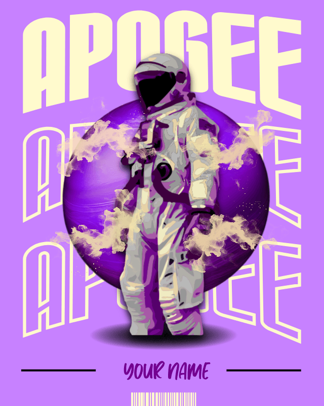
For Apogee, I explored multiple visual directions before arriving at the final merchandise concept.
Space gave me a much larger visual playground.
Astronauts. Planets. Orbital systems. Retro-futurism. Experimental typography.
Instead of locking onto the first idea, I created more than three different samples, each exploring a different interpretation of the club.
EXPLORE BEFORE YOU DECIDE.
Some concepts leaned towards bold streetwear.
Others felt more graphic and poster-driven.
The process became an exercise in understanding how the same identity could exist across completely different visual worlds.



The Problem
Apogee's S-TIC had a powerful story to tell — India's space journey, its scientists, its missions. But most space publications felt cold, technical, and inaccessible. The content was rich but the presentation wasn't pulling people in. The brief was simple: make this feel like something people actually want to read, not just something they feel they should.
Understanding the Audience
Before touching a single layout, I asked: who is this for? The target reader was a young, curious Indian — someone interested in science but not necessarily a specialist. That shaped everything. The design couldn't feel like a textbook. It had to feel like a magazine that respects the reader's intelligence while making space science genuinely exciting.
04 — “MAKE IT MORE AGGRESSIVE.”
CAMPUSIN — JALANDHAR, PUNJAB
CampusIn is a Jalandhar-based startup built around hyperlocal delivery.
The initial brief revolved around something strongly associated with Punjab — farms and agricultural landscapes.
My first concepts explored that direction through calmer imagery, natural elements and rural visual references.
Then came the feedback:
“Could you make it more aggressive and bolder?”
They also wanted the visual direction to revolve around red.
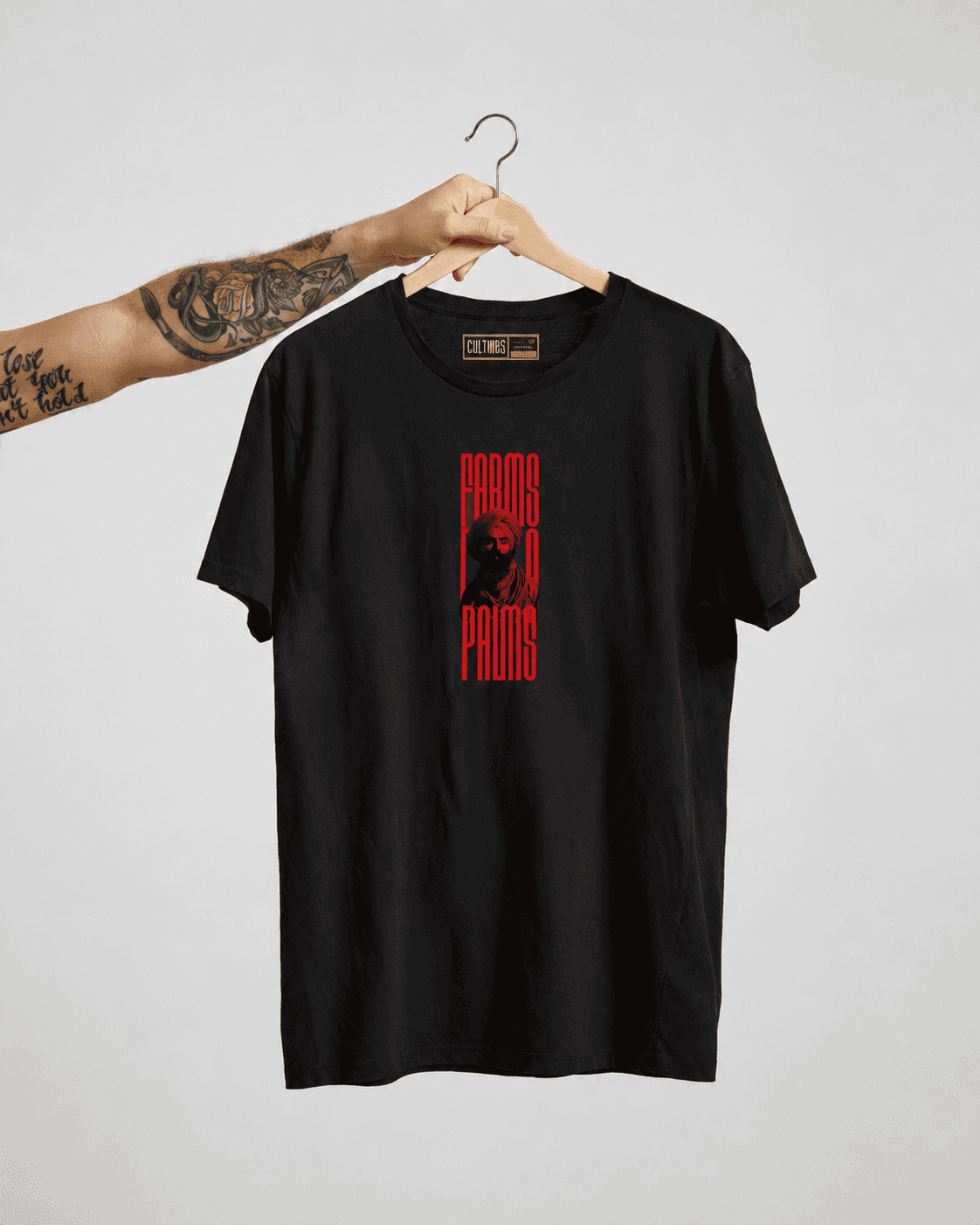
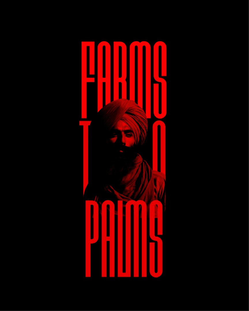
So I changed the language completely.
CALM → LOUD
ORGANIC → AGGRESSIVE
SOFT → RED
The second direction used stretched typography, extreme scale, high contrast and a much stronger graphic presence.
The idea of Punjab remained.
The way it was communicated changed.
THE SUBJECT DIDN'T CHANGE.
THE ATTITUDE DID.



The Problem
Apogee's S-TIC had a powerful story to tell — India's space journey, its scientists, its missions. But most space publications felt cold, technical, and inaccessible. The content was rich but the presentation wasn't pulling people in. The brief was simple: make this feel like something people actually want to read, not just something they feel they should.
The Design Problem
Space content has a visual cliché problem — dark backgrounds, stock NASA imagery, generic blue gradients. It all looks the same. My real challenge wasn't "make it look good." It was "make it look like nothing else in this space while still feeling credible and serious."
05 — PUNJAB INTO A GRAPHIC
BHANGRA CLUB — NIT JALANDHAR
For the Bhangra Club merchandise, I wanted the graphic to feel unmistakably Punjabi before someone even read the name.
The composition brings together cultural references, architecture, traditional performers and the energy of Bhangra into one dense visual system.
Rather than using a single cultural symbol, I treated the artwork like a collage of Punjab itself.
CULTURE, COMPRESSED INTO CLOTHING.
The goal wasn't minimalism.
The goal was recognition.
This section should be short. Your Bhangra visual is already extremely loud and detailed. Give it nearly full-screen width and let it dominate.


The Problem
Apogee's S-TIC had a powerful story to tell — India's space journey, its scientists, its missions. But most space publications felt cold, technical, and inaccessible. The content was rich but the presentation wasn't pulling people in. The brief was simple: make this feel like something people actually want to read, not just something they feel they should.
The Problem
Apogee's S-TIC had a powerful story to tell — India's space journey, its scientists, its missions. But most space publications felt cold, technical, and inaccessible. The content was rich but the presentation wasn't pulling people in. The brief was simple: make this feel like something people actually want to read, not just something they feel they should.
06 — DESIGNS WITHOUT A BRIEF
INDEPENDENT EXPERIMENTS
Not every design started with a client.
Some started because I wanted to test an idea.
A type treatment.
A composition.
A visual style I hadn't explored before.
These independent experiments became a space where I could work without brand guidelines or approval cycles.
NO CLIENT.
NO BRIEF.
JUST CURIOSITY.
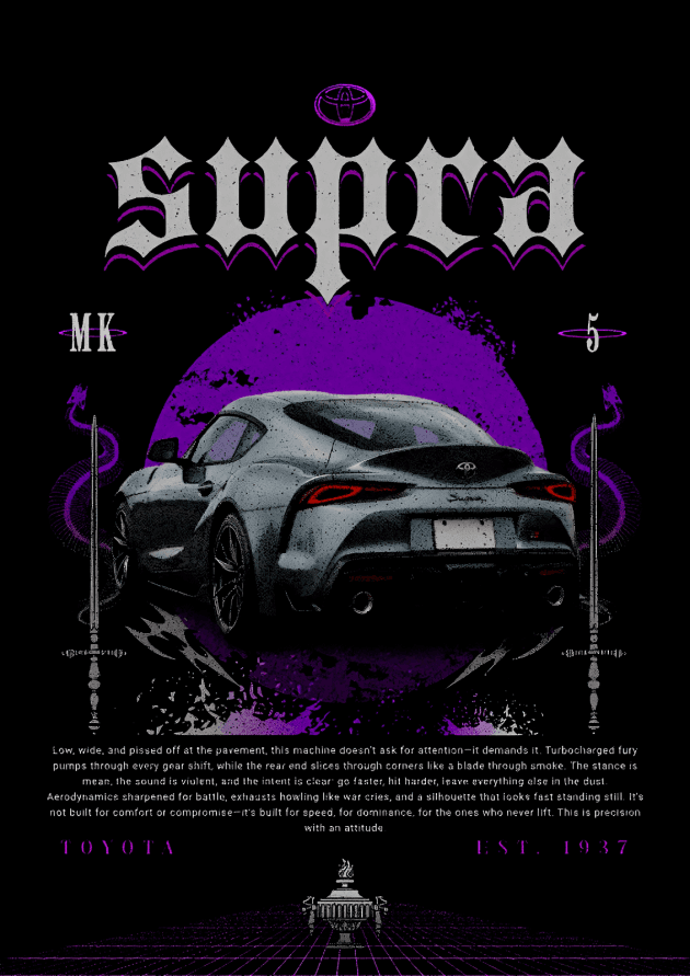
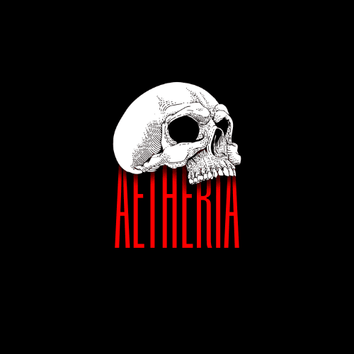
The Tokyo composition, Aetheria graphic, neo-Venus artwork and automotive graphics were explorations of typography, imagery and apparel composition.
But a few of these experiments went further than my screen.
TWO DESIGNS WERE PURCHASED BY T-SHIRT PRINTERS AND SMALL APPAREL STARTUPS.
They were eventually printed and sold through physical stores.
I even received production samples of my own designs.
FROM A RANDOM EXPERIMENT
TO A PRODUCT ON A STORE RACK.
That, for me, remains one of the most satisfying parts of designing merchandise.





The Problem
Apogee's S-TIC had a powerful story to tell — India's space journey, its scientists, its missions. But most space publications felt cold, technical, and inaccessible. The content was rich but the presentation wasn't pulling people in. The brief was simple: make this feel like something people actually want to read, not just something they feel they should.
The Problem
Apogee's S-TIC had a powerful story to tell — India's space journey, its scientists, its missions. But most space publications felt cold, technical, and inaccessible. The content was rich but the presentation wasn't pulling people in. The brief was simple: make this feel like something people actually want to read, not just something they feel they should.
Graphics made to leave the screen.
A collection of merchandise and apparel
graphics designed for college communities,
student clubs, startups, and independent
experiments.
Graphics made to leave the screen.
A collection of merchandise and apparel
graphics designed for college communities,
student clubs, startups, and independent
experiments.
Scope
Merchandise Design, Apparel Graphics,
Typography, Visual Direction & Print Design
Scope
Merchandise Design, Apparel Graphics,
Typography, Visual Direction & Print Design
Selected Work
NIT Jalandhar / SEED / Apogee /
CampusIn / Bhangra Club / Independent
Selected Work
NIT Jalandhar / SEED / Apogee /
CampusIn / Bhangra Club / Independent
Year
2024-26
Year
2024-26
Tools
Adobe Photoshop / Canva /
Kittl / Figma
Tools
Adobe Photoshop / Canva /
Kittl / Figma
