Overview
MotionPro is a sports equipment brand owned by AK Enterprises, based in Jalandhar, Punjab, offering products across categories including cricket, badminton, skating safety gear, shuttlecocks, and outdoor sports accessories.
While managing MotionPro's Amazon and Flipkart seller accounts, I worked beyond marketplace operations by creating marketing creatives and product-focused visuals that helped strengthen the brand's online identity. The objective was to improve product discoverability, increase customer trust, and support higher sales through better content and optimized listings.
The Problem
Apogee's S-TIC had a powerful story to tell — India's space journey, its scientists, its missions. But most space publications felt cold, technical, and inaccessible. The content was rich but the presentation wasn't pulling people in. The brief was simple: make this feel like something people actually want to read, not just something they feel they should.
The Problem
Apogee's S-TIC had a powerful story to tell — India's space journey, its scientists, its missions. But most space publications felt cold, technical, and inaccessible. The content was rich but the presentation wasn't pulling people in. The brief was simple: make this feel like something people actually want to read, not just something they feel they should.
The Challenge
Although MotionPro offered a wide range of quality sports equipment, its online presence lacked consistency across marketplaces and social media. Product listings needed stronger SEO, images required clearer communication of product features, and the brand needed engaging creatives that could attract attention in an increasingly competitive sports category.
The challenge was to create a cohesive visual identity while ensuring every piece of content also supported conversion and marketplace performance.
The Problem
Apogee's S-TIC had a powerful story to tell — India's space journey, its scientists, its missions. But most space publications felt cold, technical, and inaccessible. The content was rich but the presentation wasn't pulling people in. The brief was simple: make this feel like something people actually want to read, not just something they feel they should.
My Role
I handled few Good section's visual design of Issue 02 — from the cover to individual spread layouts. This included typography decisions, color palette development, illustration direction, image treatment, and the overall editorial grid system that held the magazine together across 60+ pages.
My Role
I was responsible for both marketplace management and creative execution, including:
Managing Amazon and Flipkart seller accounts
Optimizing product listings and SEO
Designing product advertisements and promotional creatives
Creating feature-focused product graphics
Enhancing product presentation for better conversions
Maintaining consistent branding across multiple product categories

The Problem
Apogee's S-TIC had a powerful story to tell — India's space journey, its scientists, its missions. But most space publications felt cold, technical, and inaccessible. The content was rich but the presentation wasn't pulling people in. The brief was simple: make this feel like something people actually want to read, not just something they feel they should.
Understanding the Audience
Before touching a single layout, I asked: who is this for? The target reader was a young, curious Indian — someone interested in science but not necessarily a specialist. That shaped everything. The design couldn't feel like a textbook. It had to feel like a magazine that respects the reader's intelligence while making space science genuinely exciting.
Design Approach
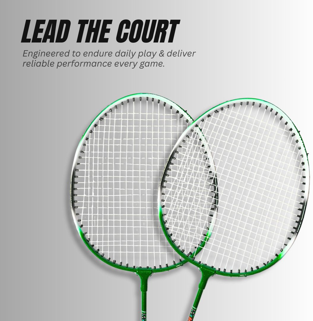
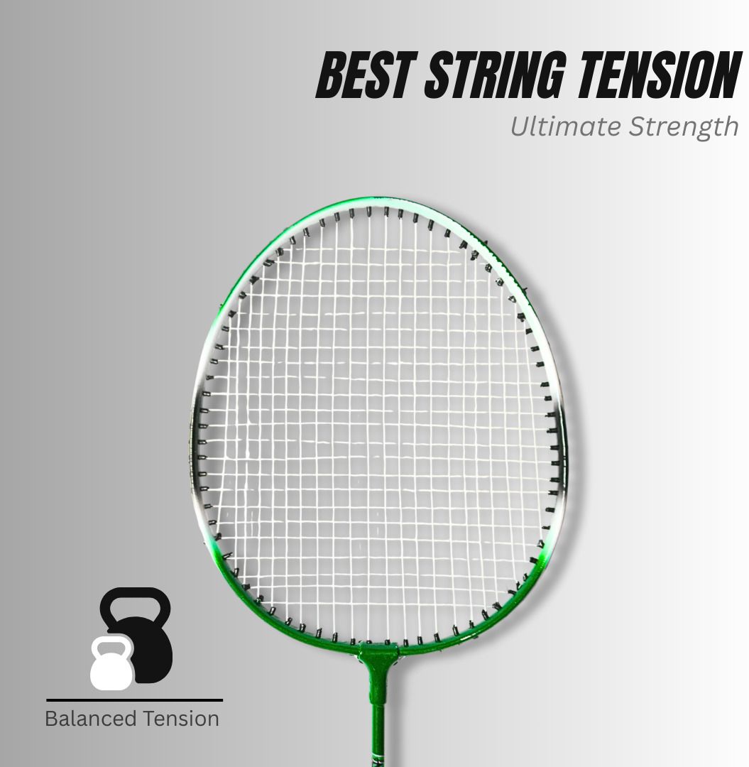
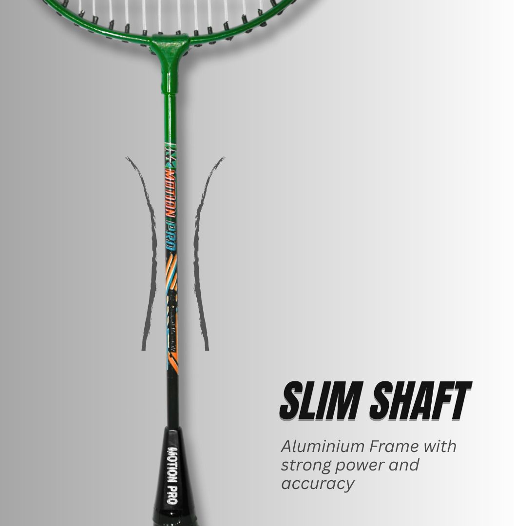
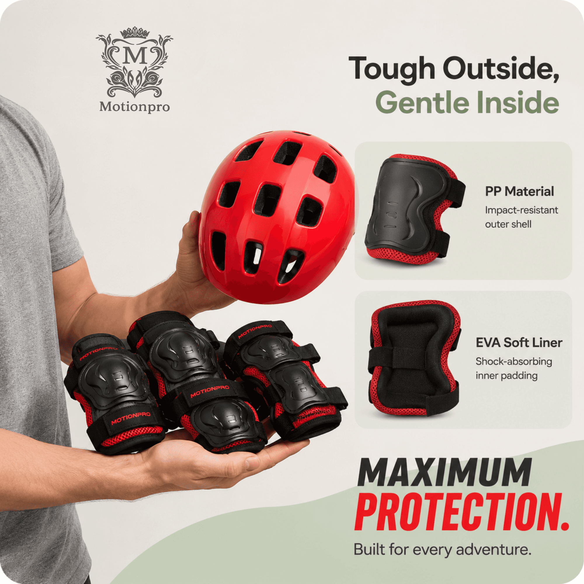
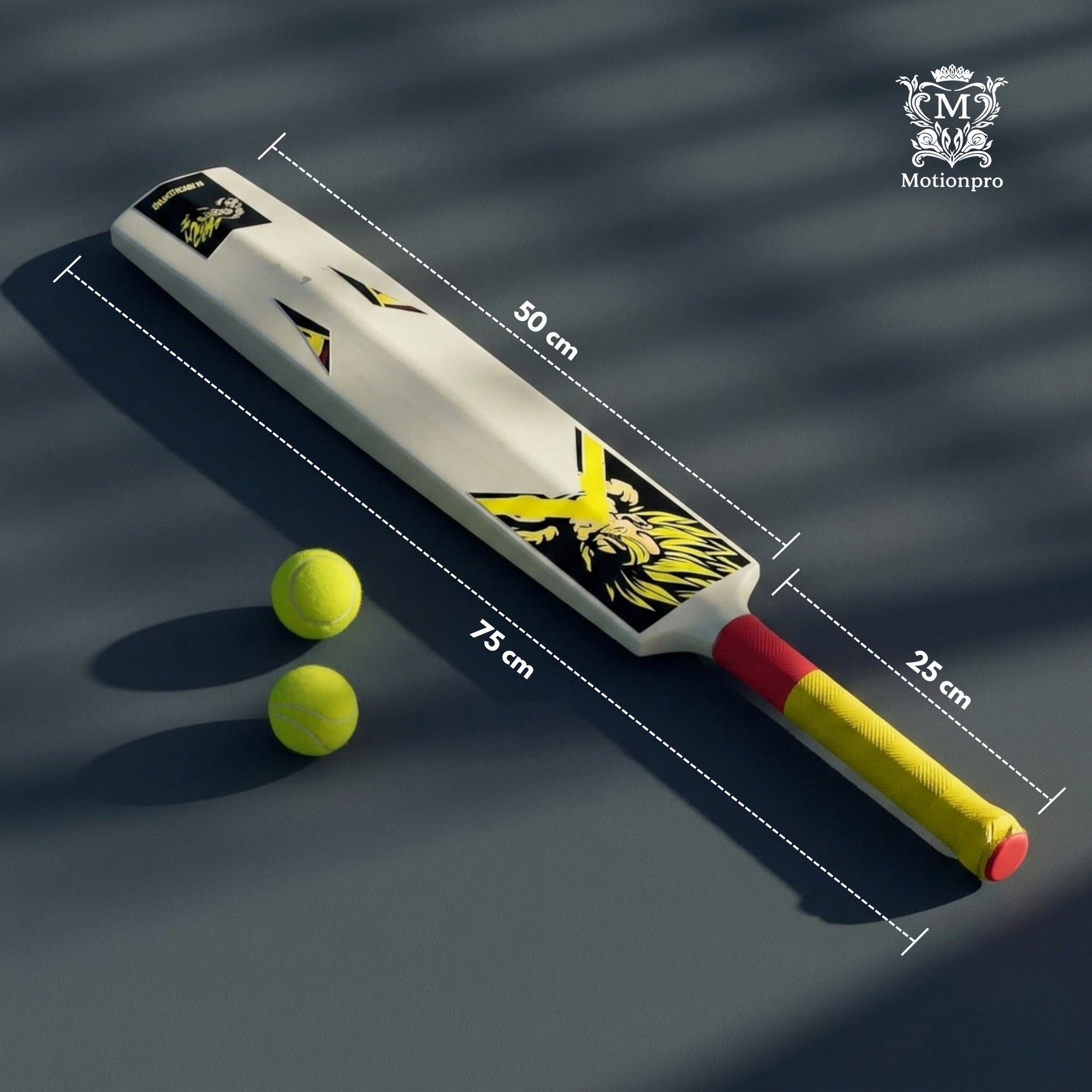
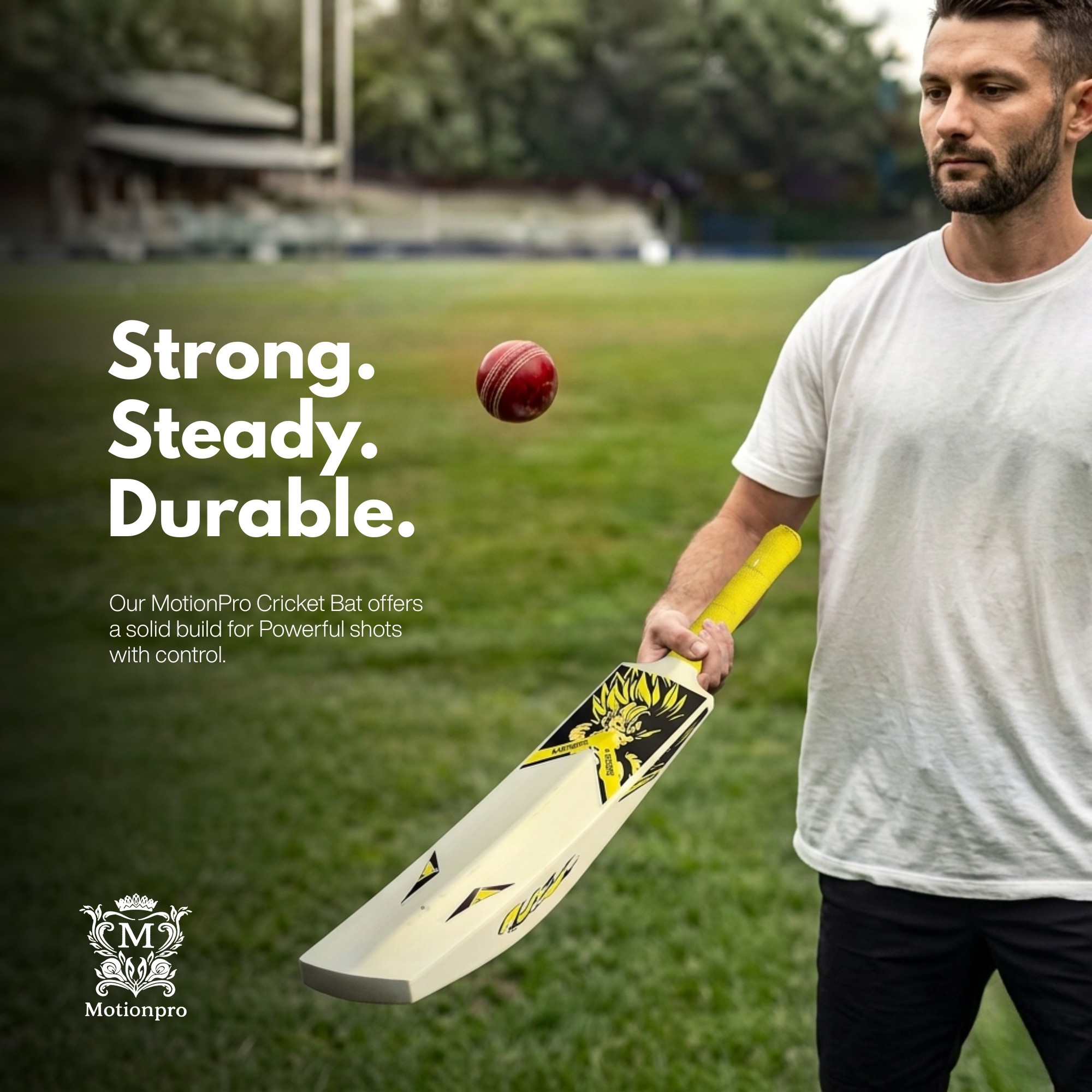
Each creative was designed with a balance between marketing appeal and product clarity. Instead of relying only on aesthetic visuals, I highlighted key product features, durability, comfort, dimensions, and performance benefits directly within the designs. Lifestyle imagery, close-up feature callouts, and bold typography helped communicate value quickly while maintaining a consistent MotionPro brand identity.
Across different product categories—from cricket bats and badminton rackets to skating protective gear—I adapted layouts, color palettes, and compositions while preserving a unified visual language that made the brand instantly recognizable.



The Problem
Apogee's S-TIC had a powerful story to tell — India's space journey, its scientists, its missions. But most space publications felt cold, technical, and inaccessible. The content was rich but the presentation wasn't pulling people in. The brief was simple: make this feel like something people actually want to read, not just something they feel they should.
The Design Problem
Space content has a visual cliché problem — dark backgrounds, stock NASA imagery, generic blue gradients. It all looks the same. My real challenge wasn't "make it look good." It was "make it look like nothing else in this space while still feeling credible and serious."
Marketplace Optimization
Alongside creative design, I worked extensively on optimizing MotionPro's marketplace presence by improving product titles, descriptions, backend keywords, and category structure. The goal was to increase organic visibility, improve search rankings, and create listings that answered customer questions before purchase, resulting in a stronger overall shopping experience.
The Problem
Apogee's S-TIC had a powerful story to tell — India's space journey, its scientists, its missions. But most space publications felt cold, technical, and inaccessible. The content was rich but the presentation wasn't pulling people in. The brief was simple: make this feel like something people actually want to read, not just something they feel they should.
The Problem
Apogee's S-TIC had a powerful story to tell — India's space journey, its scientists, its missions. But most space publications felt cold, technical, and inaccessible. The content was rich but the presentation wasn't pulling people in. The brief was simple: make this feel like something people actually want to read, not just something they feel they should.
Visual Identity
The creative direction focused on energetic sports-inspired visuals that reflected performance, durability, and confidence. Clean layouts, bold typography, high-contrast color combinations, lifestyle photography, and detailed feature callouts were used to make product benefits immediately understandable. Consistent branding across every creative ensured a professional and trustworthy appearance throughout the brand's digital presence.


The Problem
Apogee's S-TIC had a powerful story to tell — India's space journey, its scientists, its missions. But most space publications felt cold, technical, and inaccessible. The content was rich but the presentation wasn't pulling people in. The brief was simple: make this feel like something people actually want to read, not just something they feel they should.
The Problem
Apogee's S-TIC had a powerful story to tell — India's space journey, its scientists, its missions. But most space publications felt cold, technical, and inaccessible. The content was rich but the presentation wasn't pulling people in. The brief was simple: make this feel like something people actually want to read, not just something they feel they should.
Outcome
The project enabled MotionPro to present its products with greater consistency across marketplaces and promotional channels. By combining SEO-driven listing optimization with compelling visual communication, I helped build a stronger online presence that improved product presentation, enhanced customer confidence, and supported the brand's broader sales and marketing efforts.
The Problem
Apogee's S-TIC had a powerful story to tell — India's space journey, its scientists, its missions. But most space publications felt cold, technical, and inaccessible. The content was rich but the presentation wasn't pulling people in. The brief was simple: make this feel like something people actually want to read, not just something they feel they should.
The Problem
Apogee's S-TIC had a powerful story to tell — India's space journey, its scientists, its missions. But most space publications felt cold, technical, and inaccessible. The content was rich but the presentation wasn't pulling people in. The brief was simple: make this feel like something people actually want to read, not just something they feel they should.
Project Name
MotionPro — Elevating a Sports Brand
Through Marketplace Optimization
& Visual Marketing
Project Name
MotionPro — Elevating a Sports Brand
Through Marketplace Optimization
& Visual Marketing
Category
Marketplace management, Amazon
& Flipkart optimization, SEO, product
listing design, advertisement creatives.
Category
Marketplace management, Amazon
& Flipkart optimization, SEO, product
listing design, advertisement creatives.
Platform
Amazon / Flipkart / Instagram /
Digital Marketing
Platform
Amazon / Flipkart / Instagram /
Digital Marketing
Year
2026
Year
2026
Tools
Canva / Amazon Seller Central /
Flipkart Seller Hub / AI
Tools
Canva / Amazon Seller Central /
Flipkart Seller Hub / AI
