The Brief
Sanskriti is a two-day Indian cultural festival by the Regional Activity Club at NIT Jalandhar. The club needed a brochure that could introduce the festival, communicate its cultural scale, and help potential sponsors understand exactly what they would receive.
The challenge was to make a document full of information—event formats, audience demographics, previous footfall, artist history, sponsor tiers, and benefits—feel like one coherent visual experience rather than a plain sponsorship PDF.
The Problem
Apogee's S-TIC had a powerful story to tell — India's space journey, its scientists, its missions. But most space publications felt cold, technical, and inaccessible. The content was rich but the presentation wasn't pulling people in. The brief was simple: make this feel like something people actually want to read, not just something they feel they should.
The Problem
Apogee's S-TIC had a powerful story to tell — India's space journey, its scientists, its missions. But most space publications felt cold, technical, and inaccessible. The content was rich but the presentation wasn't pulling people in. The brief was simple: make this feel like something people actually want to read, not just something they feel they should.
The Design Problem
A sponsor brochure has to do two things at once:
Create excitement around the event.
Make the opportunity easy to understand and trust.
The information was varied: cultural storytelling, event photography, numbers, sponsor packages, and long-form benefit lists. If everything was treated with the same visual weight, the deck would feel dense and difficult to scan.
So the design needed a clear system that could move between emotion and information without losing the identity of Sanskriti.
The Problem
Apogee's S-TIC had a powerful story to tell — India's space journey, its scientists, its missions. But most space publications felt cold, technical, and inaccessible. The content was rich but the presentation wasn't pulling people in. The brief was simple: make this feel like something people actually want to read, not just something they feel they should.
My Role
I handled few Good section's visual design of Issue 02 — from the cover to individual spread layouts. This included typography decisions, color palette development, illustration direction, image treatment, and the overall editorial grid system that held the magazine together across 60+ pages.
My Design Direction
I built the visual language around the feeling of an Indian cultural celebration—warm, layered, expressive, and rooted in craft.
The core direction combined:
A parchment-like textured background for warmth and heritage.
Indian floral and ornamental motifs to create a recognisable cultural frame.
Large editorial serif typography for scale and celebration.
A clean sans-serif for body copy and sponsor information.
Orange, muted red, cream, and black to balance energy with readability.
Cut-out photography, collages, Polaroid-style frames, and layered images to make the deck feel alive.
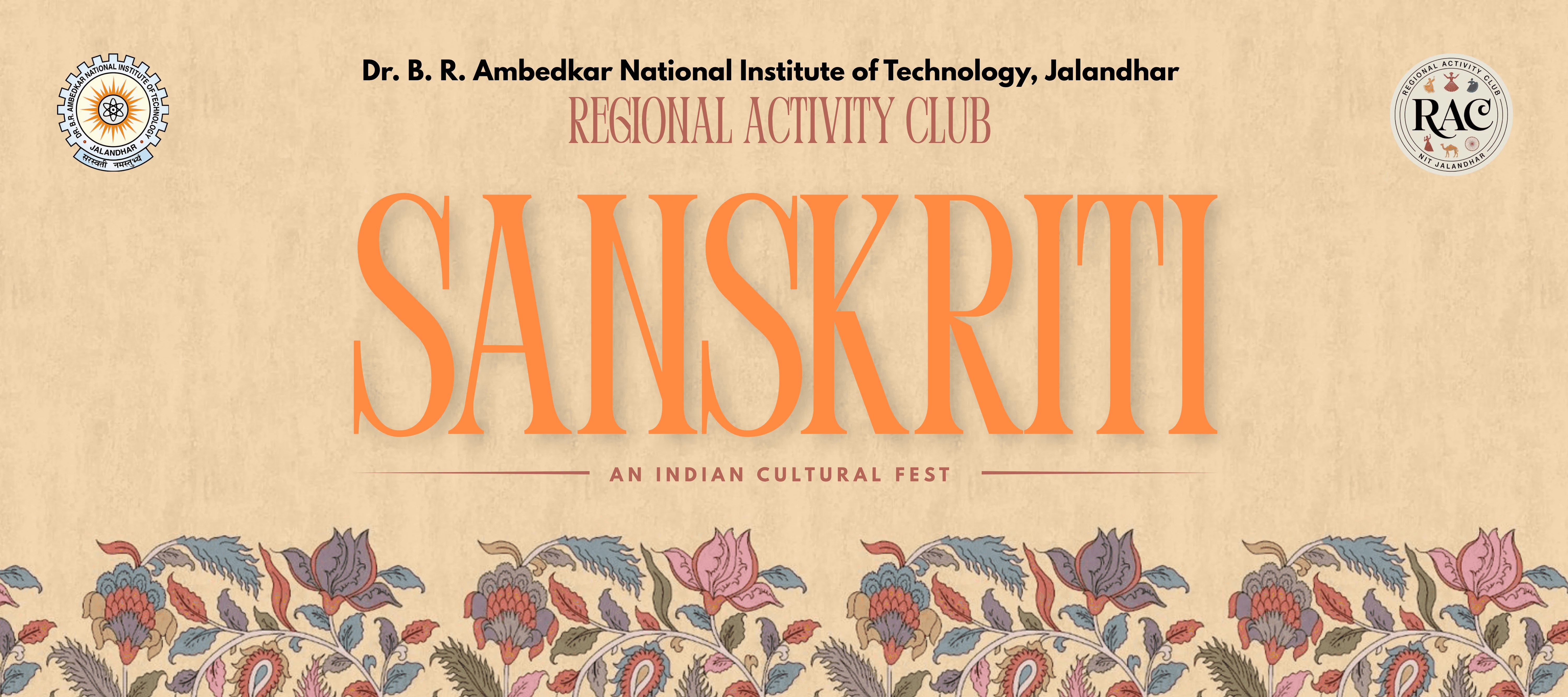
The cover established this system immediately: Sanskriti is treated as the hero, with a large orange display wordmark, floral artwork, and key event details placed in clear information pills.


The Problem
Apogee's S-TIC had a powerful story to tell — India's space journey, its scientists, its missions. But most space publications felt cold, technical, and inaccessible. The content was rich but the presentation wasn't pulling people in. The brief was simple: make this feel like something people actually want to read, not just something they feel they should.
Understanding the Audience
Before touching a single layout, I asked: who is this for? The target reader was a young, curious Indian — someone interested in science but not necessarily a specialist. That shaped everything. The design couldn't feel like a textbook. It had to feel like a magazine that respects the reader's intelligence while making space science genuinely exciting.
Content Hierarchy
Before designing the individual pages, I grouped the content into a simple narrative:
What is Sanskriti?
Who is behind it?
Why does it matter at scale?
What has RAC done before?
What can a sponsor be part of?
How can they get involved?
This helped the brochure read like a story rather than a list of sponsor benefits.
The Problem
Apogee's S-TIC had a powerful story to tell — India's space journey, its scientists, its missions. But most space publications felt cold, technical, and inaccessible. The content was rich but the presentation wasn't pulling people in. The brief was simple: make this feel like something people actually want to read, not just something they feel they should.
The Design Problem
Space content has a visual cliché problem — dark backgrounds, stock NASA imagery, generic blue gradients. It all looks the same. My real challenge wasn't "make it look good." It was "make it look like nothing else in this space while still feeling credible and serious."
Information Design Decisions
Making scale visual
Instead of hiding important numbers inside paragraphs, I turned key figures into bold visual moments: 7,000+ footfall, 10+ state communities, and 40+ regional events and competitions. These are paired with large event photographs so the statistics feel connected to a real atmosphere, not just claims on a page.
Giving each page one job
Every spread was designed around one main message. For example:
The “About Sanskriti” spread explains the two-day event format.
“The Scale & Demographics” establishes reach across multiple states.
“Our Previous Events” creates credibility through past cultural events and footfall.
Sponsor pages turn complex packages into clearer, structured benefits.
Balancing culture with clarity
The decorative elements were intentionally kept around the edges or behind content. This let the brochure feel culturally rich without making sponsor information harder to read.


The Problem
Apogee's S-TIC had a powerful story to tell — India's space journey, its scientists, its missions. But most space publications felt cold, technical, and inaccessible. The content was rich but the presentation wasn't pulling people in. The brief was simple: make this feel like something people actually want to read, not just something they feel they should.
The Problem
Apogee's S-TIC had a powerful story to tell — India's space journey, its scientists, its missions. But most space publications felt cold, technical, and inaccessible. The content was rich but the presentation wasn't pulling people in. The brief was simple: make this feel like something people actually want to read, not just something they feel they should.
Visual System
Typography
A high-contrast editorial display typeface was used for headings, paired with a friendly sans-serif for body content. This contrast gave the deck both a festive personality and a practical reading structure.
Colour
Warm orange acts as the main expressive accent, while muted terracotta red supports sponsor cards, labels, and dividers. Cream keeps the pages approachable; black provides contrast for key information.
Imagery
Event photographs were treated as evidence of scale and energy. I used collage layouts, circular crops, cut-outs, and framed images to avoid a repetitive “photo + paragraph” layout.
Motifs
Floral borders and mandala-inspired elements were used as a recurring visual thread, helping every page feel part of the same cultural world.



The Problem
Apogee's S-TIC had a powerful story to tell — India's space journey, its scientists, its missions. But most space publications felt cold, technical, and inaccessible. The content was rich but the presentation wasn't pulling people in. The brief was simple: make this feel like something people actually want to read, not just something they feel they should.
The Problem
Apogee's S-TIC had a powerful story to tell — India's space journey, its scientists, its missions. But most space publications felt cold, technical, and inaccessible. The content was rich but the presentation wasn't pulling people in. The brief was simple: make this feel like something people actually want to read, not just something they feel they should.
Key Spreads
The festival story
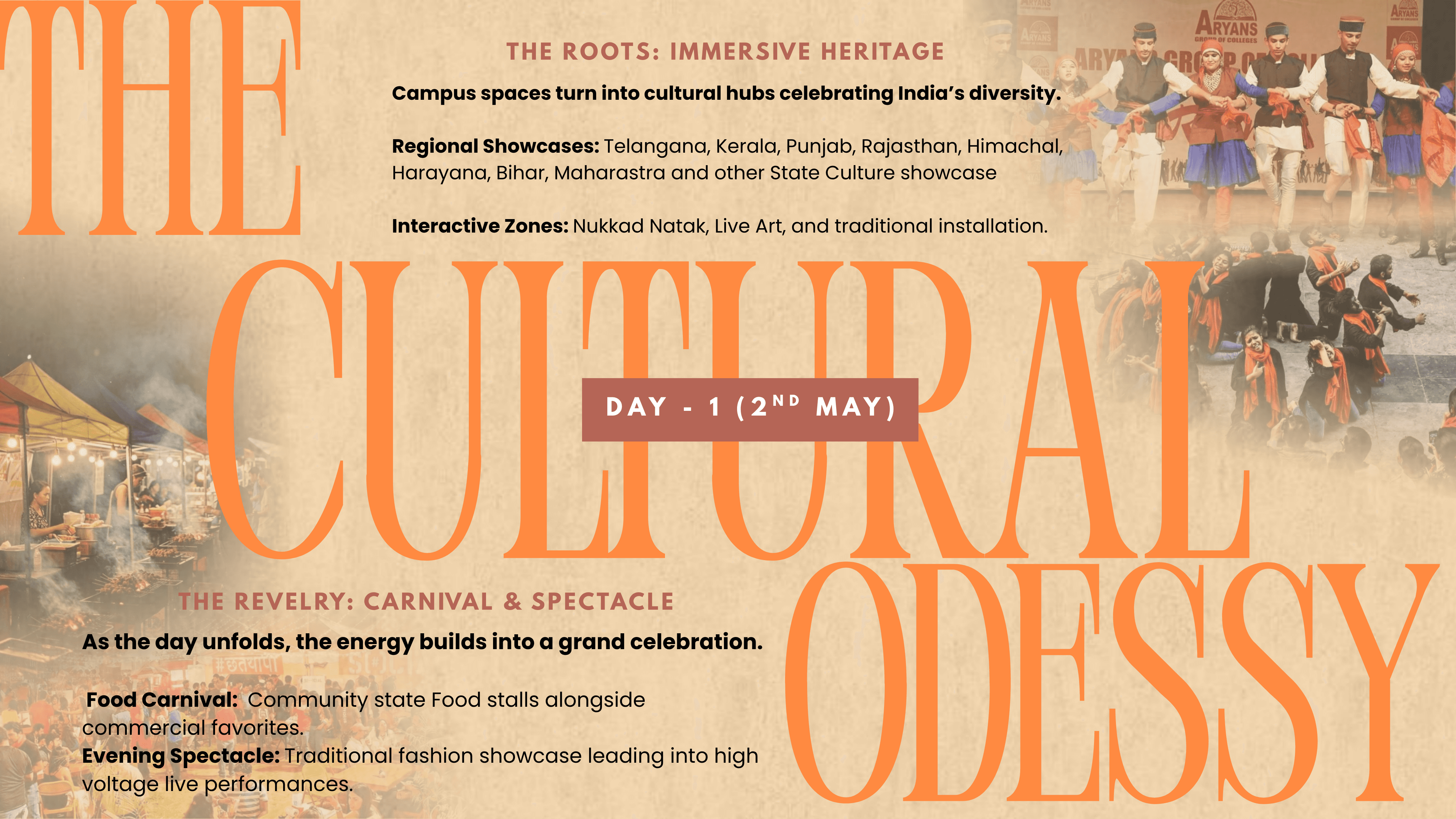
The event overview introduces Sanskriti as a cultural convergence that brings regional communities together through performances, food, stalls, and a headline act. I used a split visual treatment to distinguish Day 1 and Day 2 while keeping both within the same system.
The credibility pages
Past events, audience footfall, and co-hosted artist history were designed to build confidence before the reader reaches the sponsor packages. The artist page uses a consistent gallery structure to make the names feel like a strong proof point.
Sponsor packages
The title sponsor and co-title sponsor pages use modular benefit cards, visual labels, icons, and clear separation between investment level and deliverables. This makes dense sponsorship information easier to compare at a glance.


The Problem
Apogee's S-TIC had a powerful story to tell — India's space journey, its scientists, its missions. But most space publications felt cold, technical, and inaccessible. The content was rich but the presentation wasn't pulling people in. The brief was simple: make this feel like something people actually want to read, not just something they feel they should.
The Problem
Apogee's S-TIC had a powerful story to tell — India's space journey, its scientists, its missions. But most space publications felt cold, technical, and inaccessible. The content was rich but the presentation wasn't pulling people in. The brief was simple: make this feel like something people actually want to read, not just something they feel they should.
What I Learned
This project taught me that brochure design is not only about making pages look attractive. It is about controlling attention.
I learned to:
Build a visual system before designing individual pages.
Use typography to create hierarchy in content-heavy layouts.
Treat statistics and sponsor benefits as design elements, not just text.
Use cultural references with restraint, so they support the message instead of overpowering it.
Design for a real reader—in this case, a potential sponsor who needs both emotion and clarity before making a decision.
The Problem
Apogee's S-TIC had a powerful story to tell — India's space journey, its scientists, its missions. But most space publications felt cold, technical, and inaccessible. The content was rich but the presentation wasn't pulling people in. The brief was simple: make this feel like something people actually want to read, not just something they feel they should.
The Problem
Apogee's S-TIC had a powerful story to tell — India's space journey, its scientists, its missions. But most space publications felt cold, technical, and inaccessible. The content was rich but the presentation wasn't pulling people in. The brief was simple: make this feel like something people actually want to read, not just something they feel they should.
Project Name
Sanskriti — Visual Identity &
Sponsorship Deck
Project Name
Sanskriti — Visual Identity &
Sponsorship Deck
Category
Event branding, presentation / brochure
design, social / print collateral
Category
Event branding, presentation / brochure
design, social / print collateral
Client
Regional Activity Club,
NIT Jalandhar
Client
Regional Activity Club,
NIT Jalandhar
Year
2026
Year
2026
Tools
Canva / Figma
Tools
Canva / Figma